Pop
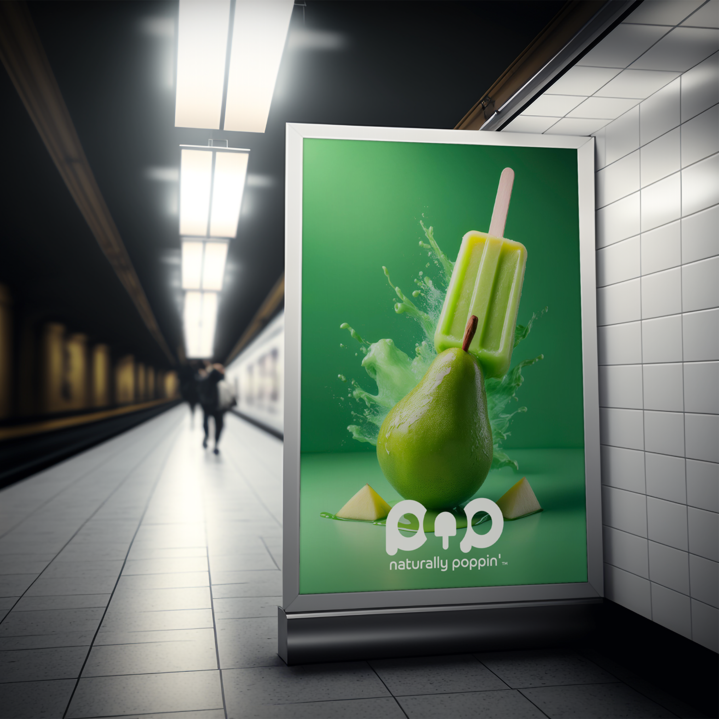
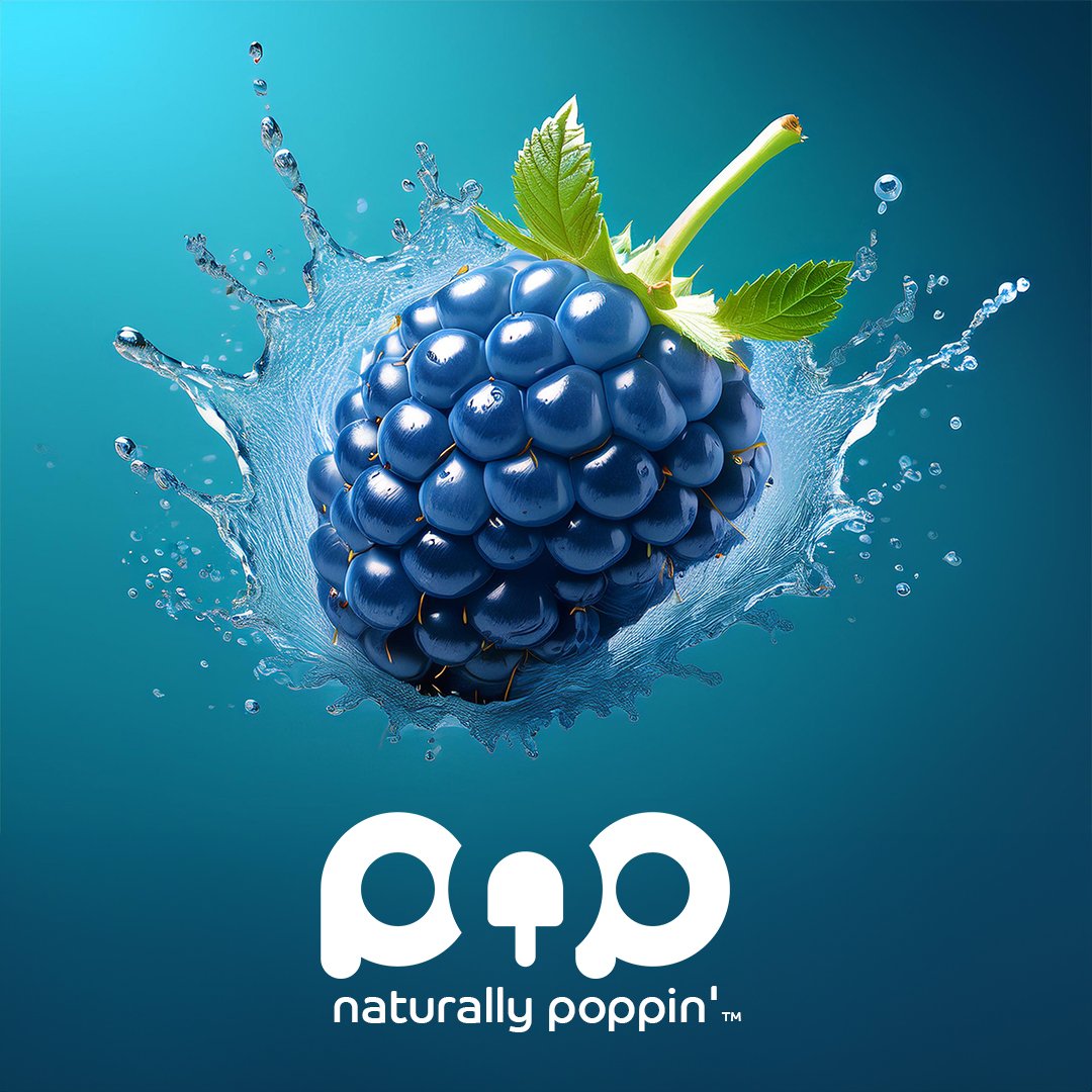
Pop is a new brand that brings joy to the sunny days with its naturally fruit flavoured popsicles. Crafted exclusively from the freshest fruit juices, these ice treats promise vibrant flavours and a burst of colour that appeals to all ages. Whether you're a child seeking a cool delight or an adult searching for a guilt-free refreshment, Pop offers a wholesome alternative to traditional frozen snacks. Each popsicle is a celebration of nature's sweetness, making it the perfect companion for a healthy, delicious summer treat.
Creative Direction // Graphic Design // Illustration

Branding & Visual Direction
The brand identity for Pop is built around a playful, vibrant, and colorful theme to reflect the fun, fresh fruit flavors of its ice lollies. We created a custom logo using the Co Headline font, which perfectly captures the brand’s energetic and lively spirit. The bold, round shapes of the font evoke a sense of whimsy and approachability, while the vibrant colors used in the logo mirror the natural fruit ingredients in Pop’s products. This cohesive identity ensures that every aspect of the brand—from packaging to marketing—feels fun, fresh, and bursting with flavor.
PRIMARY LOGO
BRAND MARK
LOGO VARIATION


Illustrations & Badges
A set of colourful badges was created to be used as brand accents. They can be implemented on stickers, clothing, and other branded collateral, allowing for a cohesive and engaging brand presence. The vibrant colours and unique designs will appeal to a broad audience, reinforcing the brand's message and values across various platforms.


