Pl8
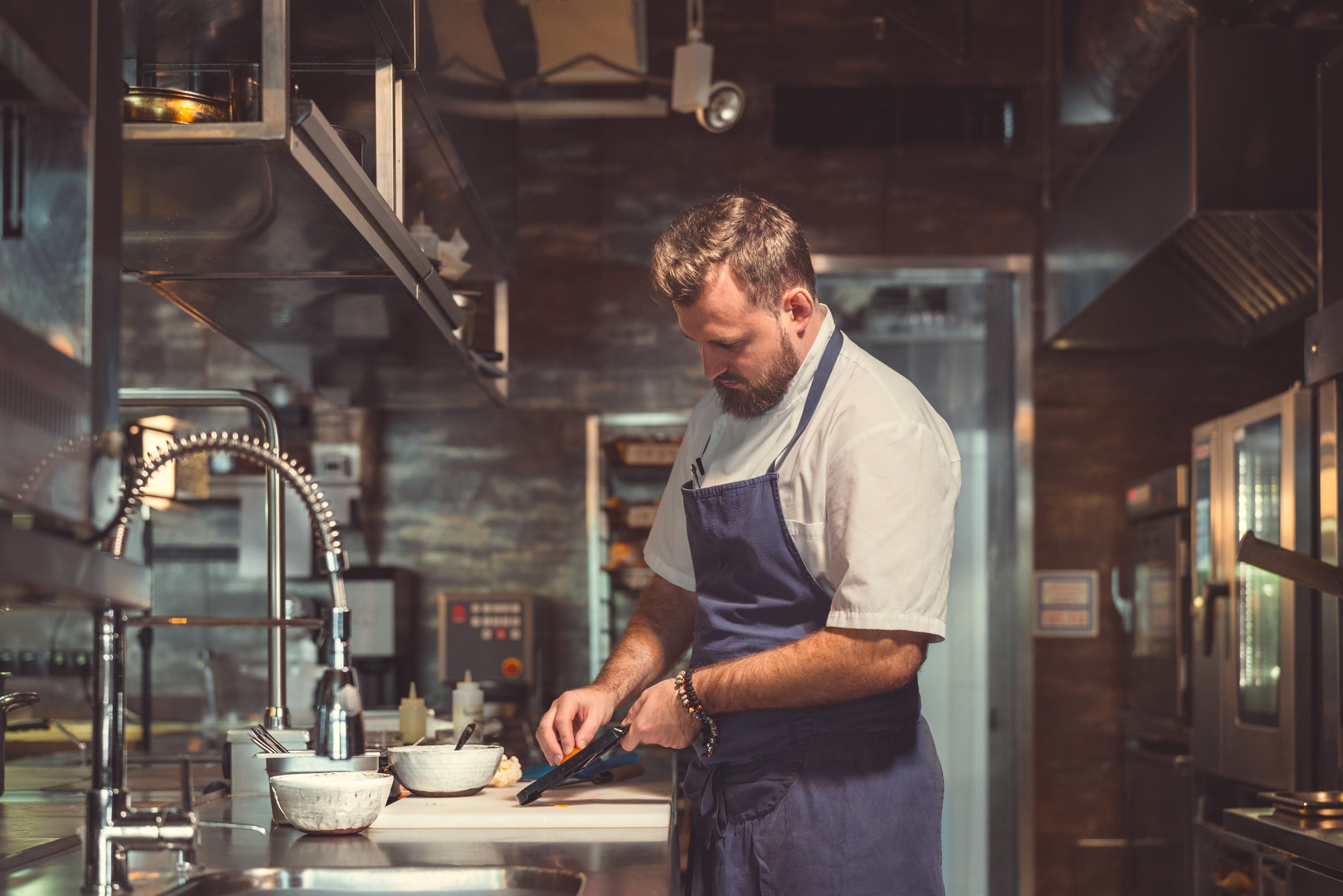
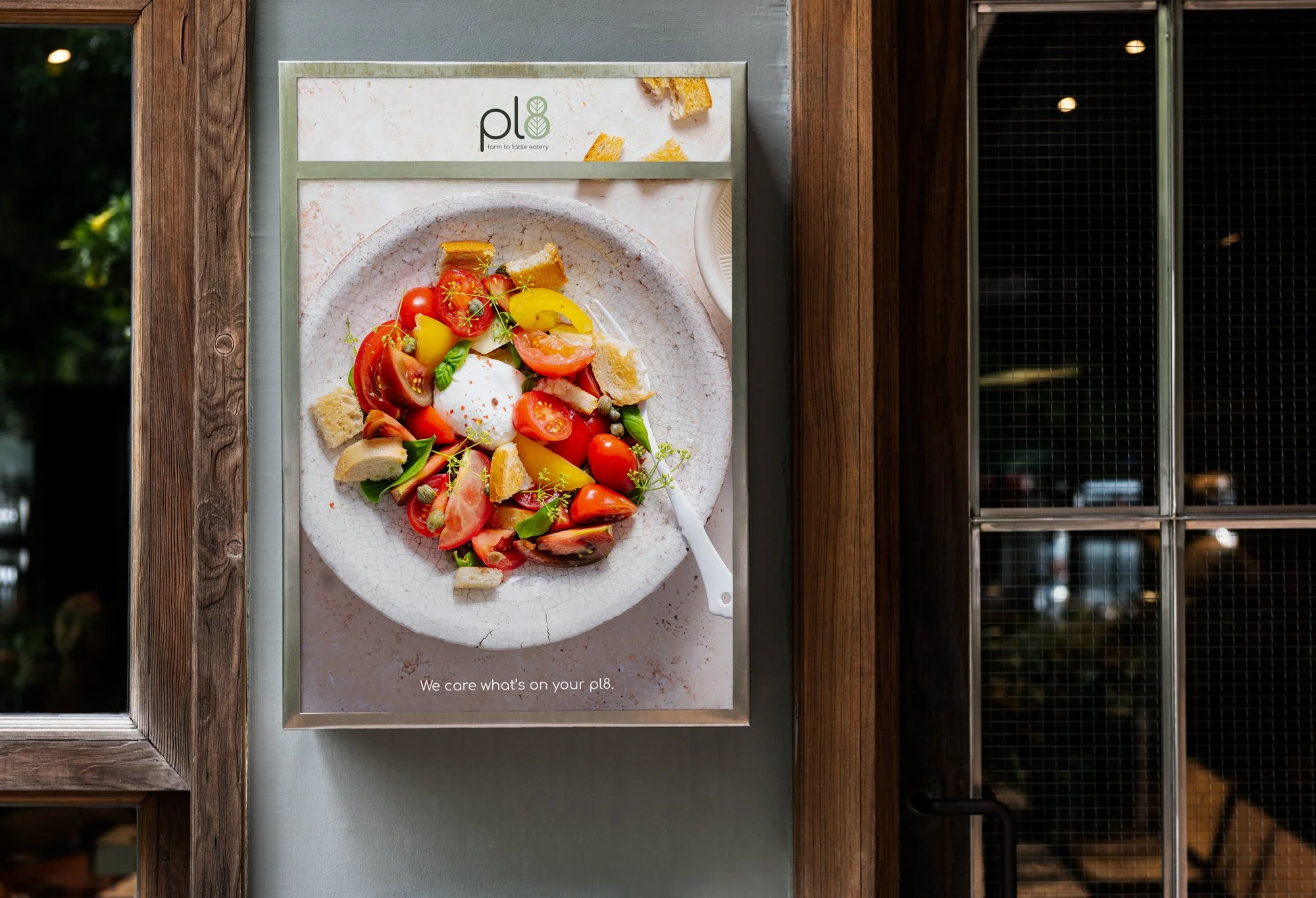
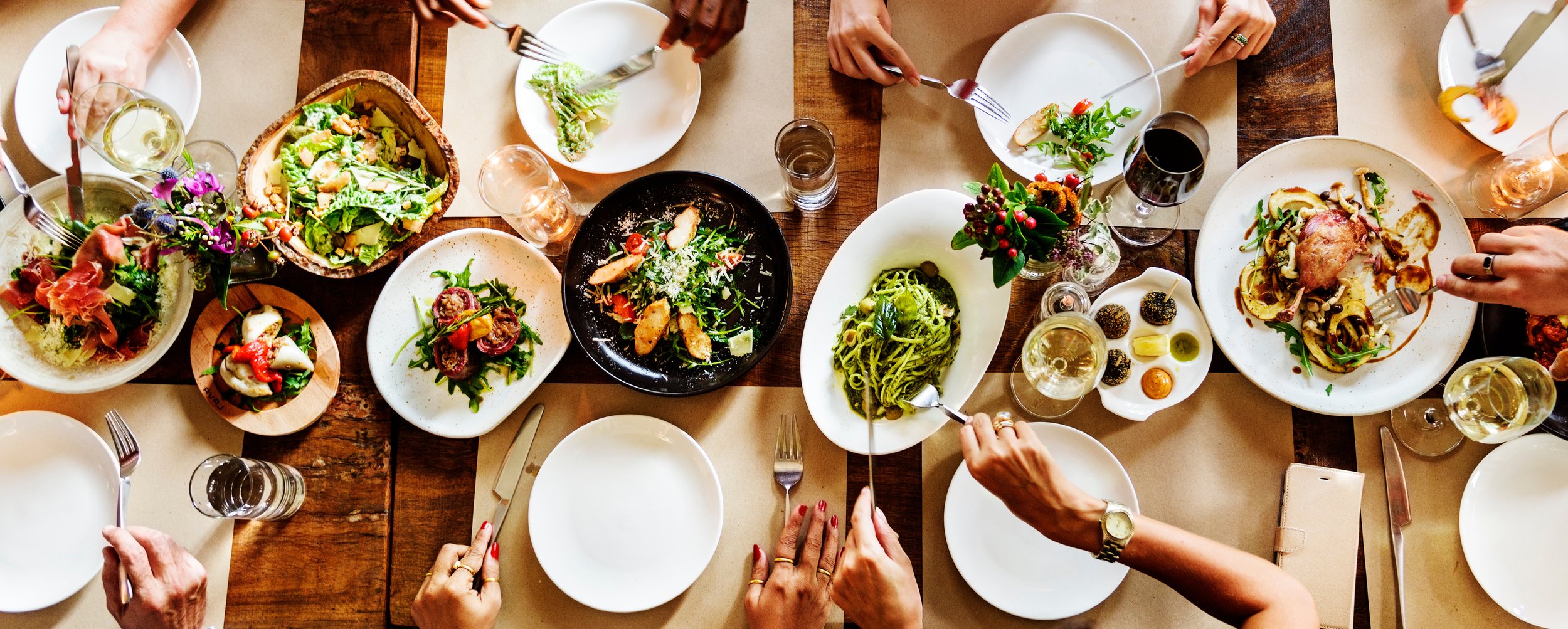
Pl8 is a refined farm-to-table eatery that showcases the abundance of local ingredients, offering a seasonal menu that reflects the region's agricultural bounty. The restaurant's elegant yet comfortable setting provides a warm atmosphere, inviting diners to savour thoughtfully crafted dishes that celebrate freshness and sustainability. Each plate is a testament to the culinary team's dedication to quality, highlighting the unique flavours of locally sourced produce.
Creative Direction // Graphic Design // Illustration

Branding & Visual Direction
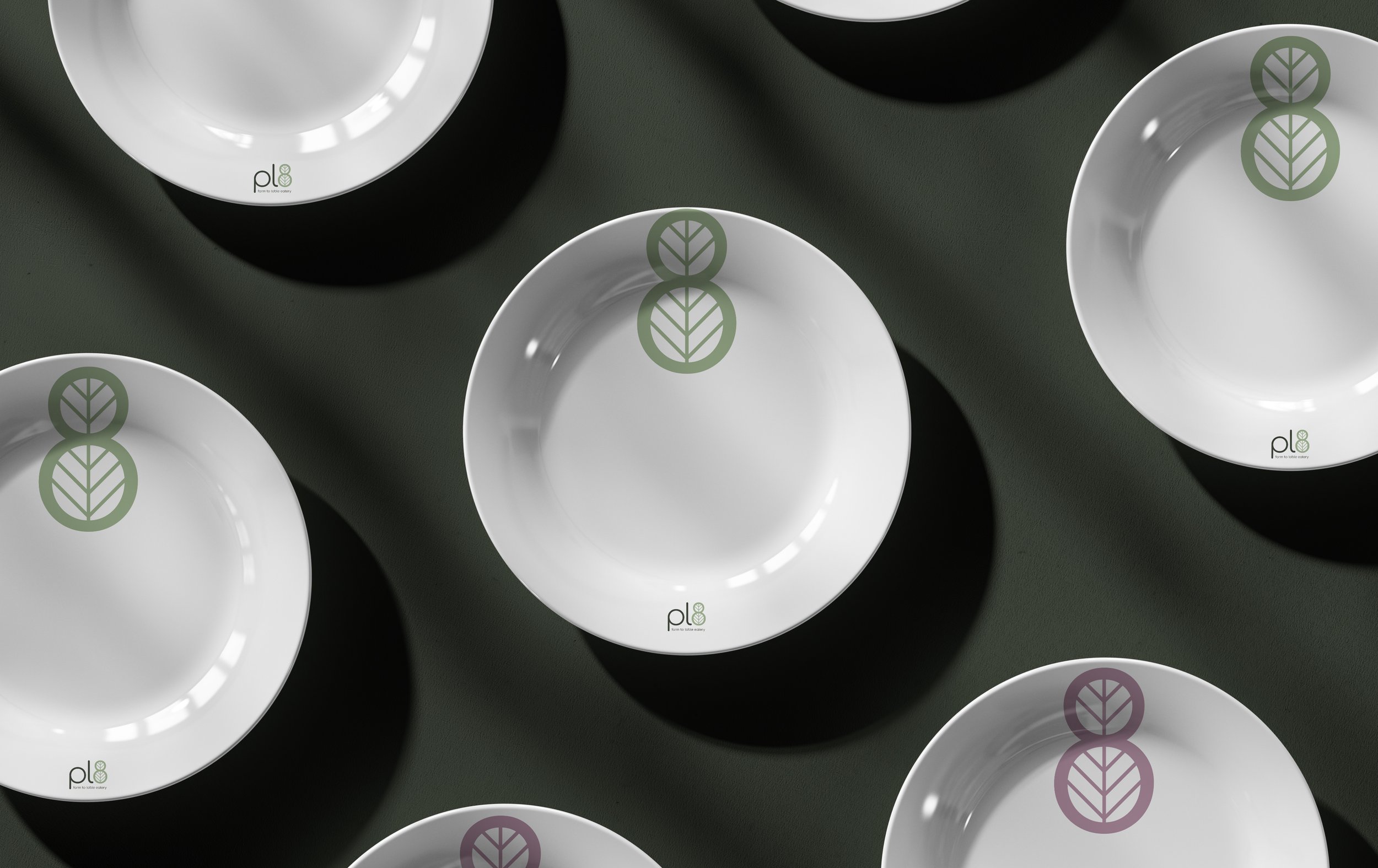
Pl8's commitment to sustainability and seasonality is reflected in its fresh visual identity, designed to create an inviting atmosphere. The bespoke logo is a central element, highlighting the brand's mission while ensuring clarity and recognition. A carefully selected color palette complements this by incorporating tones that evoke a sense of nature and freshness, reinforcing the seasonal aspect of the menu. This visual direction not only enhances the brand's aesthetic appeal but also aligns with its values, promoting a comfortable hospitality experience for guests. Overall, the identity encapsulates Pl8's dedication to offering a conscientious and welcoming dining environment.
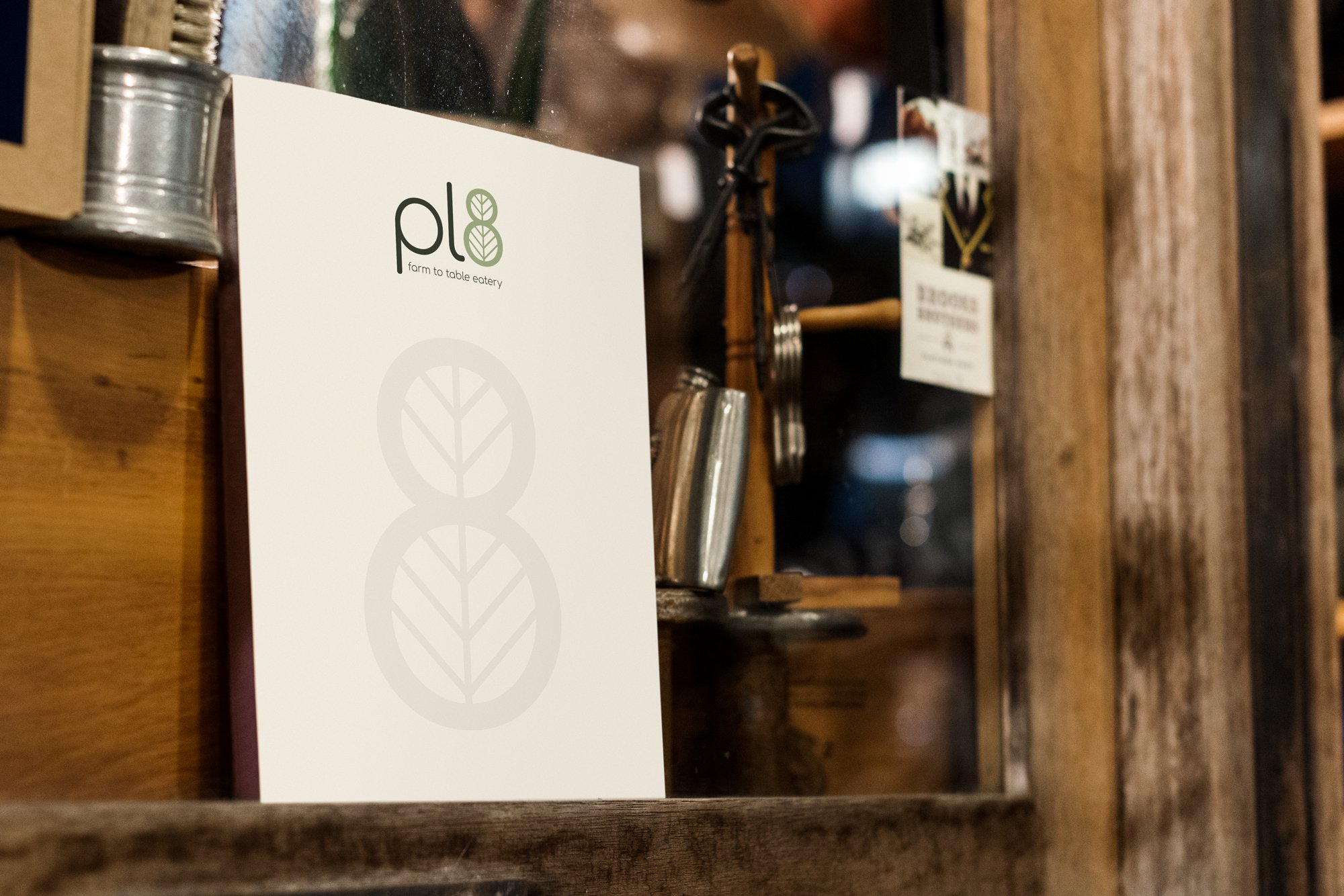
PRIMARY LOGO

BRAND MARK
SECONDARY LOGO

Typography
The Comfortaa font, designed by Johan Hnatek, is a geometric sans-serif with rounded shapes. Its simple design complements Pl8's natural elegance. The soft curves and clear letters create a warm, welcoming look, emphasizing hospitality. The main logo modifies the Comfortaa font and includes a brand mark featuring the number 8 and a leaf, symbolizing Pl8's dedication to sustainability and seasonal offerings for guests.
As a complimentary font we used Open Sans, which pairs nicely with Comfortaa due to its clean lines and simplicity, making it ideal for long-form text or smaller elements.

Color Palette
A thoughtfully curated color palette enhances the overall design by integrating hues that reflect the essence of the natural world and add a refreshing touch. The primary use of soft green serves as the foundation of the brand identity, while lighter tints enrich this base and create a harmonious visual experience. The introduction of warm pink accents adds a lively contrast, infusing an element of vibrancy that draws attention and invites engagement, perfectly aligning with the seasonal themes of the menu.